they still do white text on a lime green background despite every accessibility guidance to the contrary. if I used white text on a lime green background at my job I would be reprimanded. this is malicious compliance.
Before iMessage, they used the green bubbles for SMS. So unless Apple was planning a long con, they believed the green bubbles were fine for their customers for years, and switched to a new color (blue) when iMessage came about.
For some reason reading this, I didn't believe you, and imagined "black text on green bg" to be very ugly, but you're totally right. There's the classic look we remember. Hmm.
Yeah it’s also where bookmark, find, print, sharing, and a ton of other stuff are. It’s not like it’s some menu nobody ever looks at, it’s an entirely normal place for something like that to be based on what else they’ve put there.
Would you not be reprimanded for white text on a cyan background?
That is the alternative on iMessage.
The bubble is not blue.
   Edit: to be fair the text is also not "white"
   The approximate (sRGB) color codes are:
   "green"     #39ff5a  (57,255,90)
   "white"     #fdfdfd (253,253,253)
   "grey"      #d8d8d8 (216,216,216)
   "blue grey" #aeb9cc (174,185,204)
   "blue"      #218aff (33,138,255)
All the contrasts are terrible, but clearly a marketing decision.
WebAIM Contrast Checker says the standard green/white and blue/white combos both fail by default, so you're sort of right, but, details...
> "green" #39ff5a (57,255,90) ...
This list of colors is both inaccurate and very inaccurate.
In fact, there is not one single green (or blue) color in iMessage, and anyone who says there is is mistaken.
1. The bubble colors show in a gradient from the bottom of the screen (newer messages have more contrast) to the top of the screen (older messages have less contrast). The standard green at the bottom for the newest message is measured with the macOS built-in digital color meter from a screenshot taken on my iPhone is [51,199,89]. The standard green at the top is [56,228,100].
2. The OP is just being foolish on the internet. Enabling the increased contrast accessibility mode in iOS settings turns the green at the bottom into a dark forest which very easily passes for anyone who actually needs it and isn't just talking out of their ass on the internet to bash iPhones without having used one.
> to be fair the text is also not "white"
macOS digital color meter says the text is white [255,255,255].
Thanks, I agree about the accessibility setting. I know the iPhone at least doesn't actually use sRGB so the numbers are bound to be a bit off, but I'm surprised it's that far off.
Also, I'd note for modern iOS even just in dark mode the writer is in "black/white", while it's your own messages that are "blue" or "green" depending on whether its RCS so readability is less of an issue.
iOS supports increasing color contrast for anyone who wants it, and whining about iMessage bubble colors while ignoring that fact is doing the world a huge disservice.
For your own messages that you wrote and sent, not anyone else’s, and the contrast lower down on the screen is fine, it’s only at the top of the screen when it’s doing the fade-to-indicate-you-can-scroll-for-more thing that it runs afoul of contrast minimums.
1) The examples in those screenshots are way lower contrast than my actual messaging app on the real device. Maybe it wasn’t that bad when they did the calculations, but it’s not a great sign.
2) The author believes Android users’ messages show up green, so I wonder if they’ve ever even used an iPhone.
3) The messages are in fact not hard to read and you can crank up contrast system-wide if that or anything else gives trouble (and if these do, you’ll need improved contrast to browse the web, anyway).
The examples looked very close to a real device to me. What is the contrast ratio on your device?
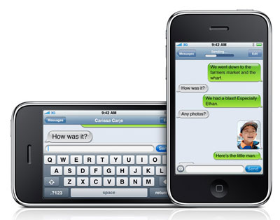
The author identified correctly the message colors. "When you send a text to someone, your message floats to the conversation area in a blue or electric green message bubble (depending on whether you’re texting with another iPhone/iPad/Mac user or some other device)."
Many iPhone users make the error you believed the author made. And the criticism would be valid if they never used an iPhone. Please do not use logical fallacies.
Calling the green bubbles not hard to read is your opinion. Opposed by other opinions and Apple's guidelines. Not fact.
The system high contrast mode makes some other apps less accessible. It makes weather icons all white for example.
The error is in the texts in one of the images. Observing that someone doesn’t appear to be familiar with the thing they’re writing about isn’t a logical fallacy.
Common sense? If Apple refuses to make obvious accessibility changes to drive customers to some alternative first-party product, that's probably going to get brought up during antitrust hearings.
iPhones are packed to the gills with accessibility features including for contrast, text size, bolding text, filters for the color blind, text to speech and color inversion.
It's not unreasonable for Apple to appreciate an aesthetic that is less accessible considering they provide the tools for users to customize the device for their needs.
The majority of people have no problem with the contrast of the Messages app, or at least it's never been a complaint that I've heard. That's not to say we shouldn't consider those who do have problems, but, again, there are options for those people.
That is in fact one of the accessibility settings. Increases contrast front the blue bubbles too, and color contrast between foreground and background colors system wide.
This might sound strange but most people with iPhones actually like how their phones look and behave. Personally I’m not the biggest fan of this era of UI design, but it’s silly to assume hostility on Apple’s part. Every year they announce even more accessibility features, and it makes sense to because they really want more people to actually be able to use the phones they sell.
You don't seem to have a great level of awareness of the world.
There are plenty of regulatory bodies, especially the EU, who have forced Apple to do things it doesn't want to.
They are making noise about interoperability of communications and rather than have the US (we don't have RCS over here, so it's meaningless for us) make rules that forces their hand in a manner that may not be how Apple want to do things, they get out ahead to reduce the power of the argument.
The fact that it's a shitty implementation is the feature.